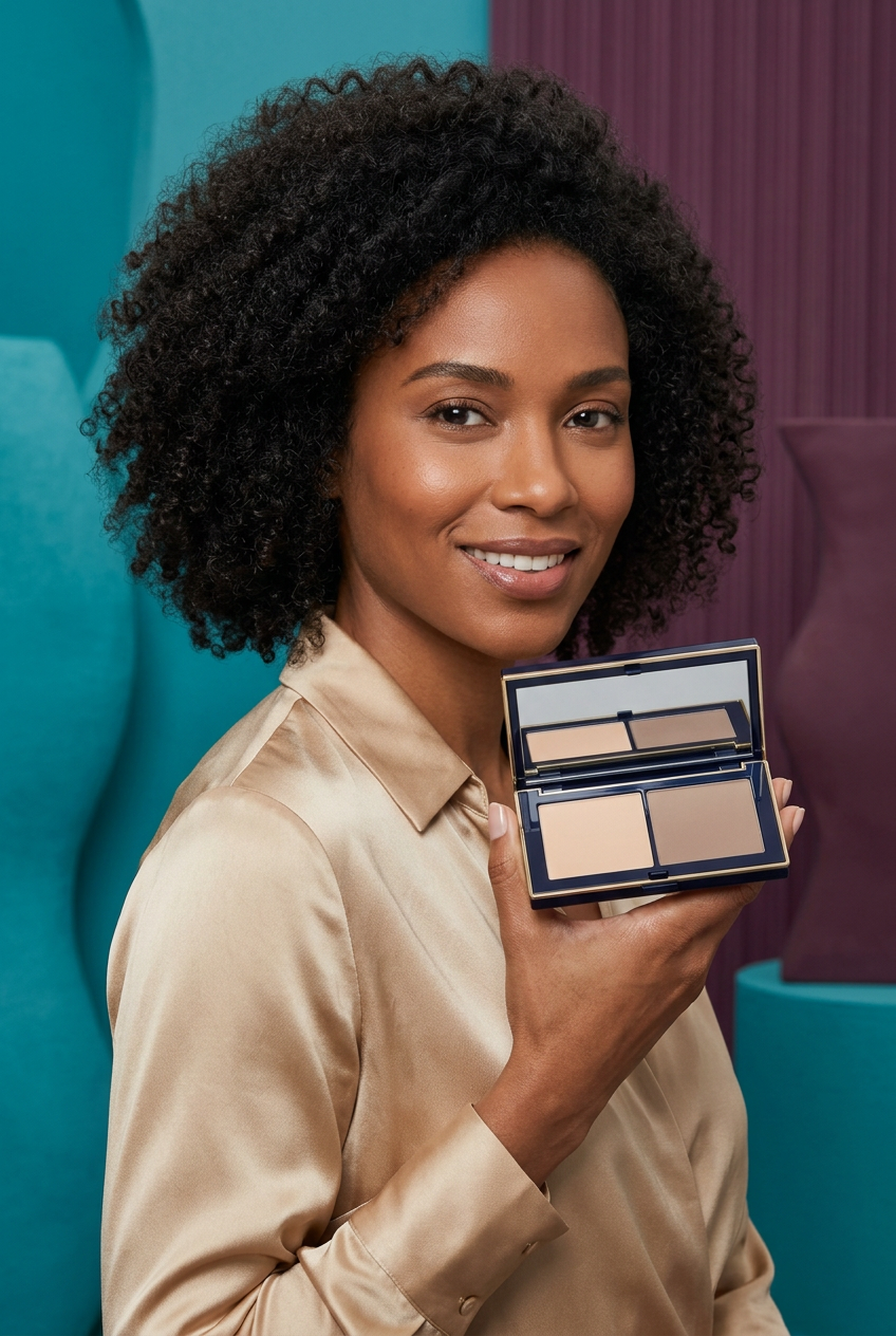
Taupe Architecture Duo Contour Palette — Light Beige & Cool Taupe Powders in a Navy-and-Gold Mirror Case
Taupe Architecture Duo Contour Palette — Light Beige & Cool Taupe Powders in a Navy-and-Gold Mirror Case
🎁Daily: The first 200 customers to place an order will receive double the product as a gift!
Couldn't load pickup availability

Taupe Architecture Duo Contour Palette — Light Beige & Cool Taupe Powders in a Navy-and-Gold Mirror Case
CONTOUR PALETTE
Beige & Taupe Duo
Midnight navy. Champagne gold. Color, considered.

📐 A study in balance: two shades, two different jobs
Taupe Architecture approaches face makeup as a relationship between lighter and darker color. The concept contains two rectangular powder pans in one horizontal midnight-navy compact: a light neutral beige on the left and a cool taupe-brown on the right. There is no rainbow of similar shades to sort through. Instead, the design invites you to consider where contrast belongs in your makeup and where the face is better left alone.

First, read the palette
The pale beige direction and the deeper taupe direction are intentionally distinct. Do not assume that the lighter pan is a concealer or that the darker pan is a bronzer. This is a proposed powder contour palette, and the final product instructions should define its intended use. Whether either shade suits your complexion depends on your skin depth, undertone, and the real formula. One pair cannot be represented as a universal match.

Second, choose the scale of the look
For a restrained daytime composition, consider a small amount of contrast rather than building a highly visible stripe. For an editorial makeup direction, a more deliberate difference between light and dark can be an artistic choice. In both cases, check the whole face from a normal viewing distance. What seems balanced in an extreme close-up may look much stronger once you step back.

Third, work with your own features
Use an appropriate clean brush and follow the supplied instructions. Start with a modest amount, place carefully, and assess before adding more. General contour artistry often focuses on the appearance of shadow near the cheek area, but that does not mean every face needs the same placement. Move the brush in a direction that allows you to soften the border rather than extend the color automatically toward the mouth. Cosmetic contouring changes the appearance of contrast; it does not physically reshape the face.

Fourth, check the transition
Look for the edge between the darker color and the surrounding makeup. A sudden border may be a deliberate graphic effect, but if you want a subtle result, concentrate on refining that transition rather than covering the entire area with more powder. Keep a clean tool available so you can assess blending without continually introducing more pigment. Consider how cheek color and highlighter will sit nearby before adding either.

An object designed around the pair
The two equal rectangular pans sit side by side under one rectangular mirror. A midnight-navy frame and thin champagne-gold border keep the presentation precise and uncluttered. The terracotta, turquoise, and saffron objects in the campaign are styling elements, chosen to separate warm scenery from the cooler taupe direction. The compact itself remains unbranded, with no printed logo or embossed powder decoration.
The questions worth asking
Is this two separate products? No, the concept is one compact containing two powder colors. Is it guaranteed to match your skin? No; assess the real shades against your complexion. Does the image prove blendability or longevity? No; generated photography cannot establish either. Are brushes or scenery included? No, those are props. Keep the mirror, rim, and tools clean and follow the final product storage directions.
AI-generated imagery describes a proposed design, not a verified physical stock item. Confirm ingredients, net contents, shade accuracy, final packaging and usage instructions with the actual supplied product before purchase. Taupe Architecture is a considered two-color starting point for your makeup, not a shortcut around finding the right shades for your face.
The palette in perspective